
Stone House Sanctuary - Part Two
REBECCA McALPIN Photographer
VESTIGE HOME Stylist
This post contains affiliate links.
Welcome back to Part Two of our #StoneHouseSanctuary project reveal.
This is Sara, and I’m back to walk you through our newly renovated kitchen designed in collaboration with vestige HOME. In case you missed it, be sure to check out Part One of the project here. After completing the Family Room, we decided that it was time to tackle the adjacent kitchen. The two spaces are connected through a large 11 foot cased opening. We knew that we wanted the two rooms to be cohesive but distinctive while adding functionality and personality.
Before we dive into the reveal, let’s look back at the “before” kitchen. A few years after moving into the home, we completed a “kitchen refresh.” We reorganized and painted the existing cabinetry, updated the hardware, removed a soffit and the upper cabinets, addressed lighting and ventilation issues, added open shelving, and installed a down-and-dirty plywood backsplash. After about four years, the refreshed space, while better than what we had when we moved in, still lacked a lot of functionality, storage, and the layout wasn’t working for our family.

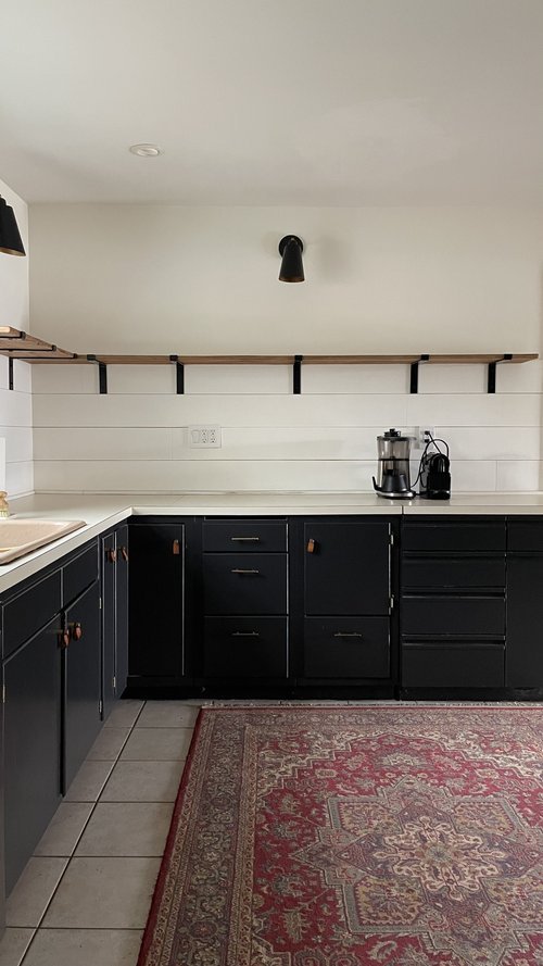

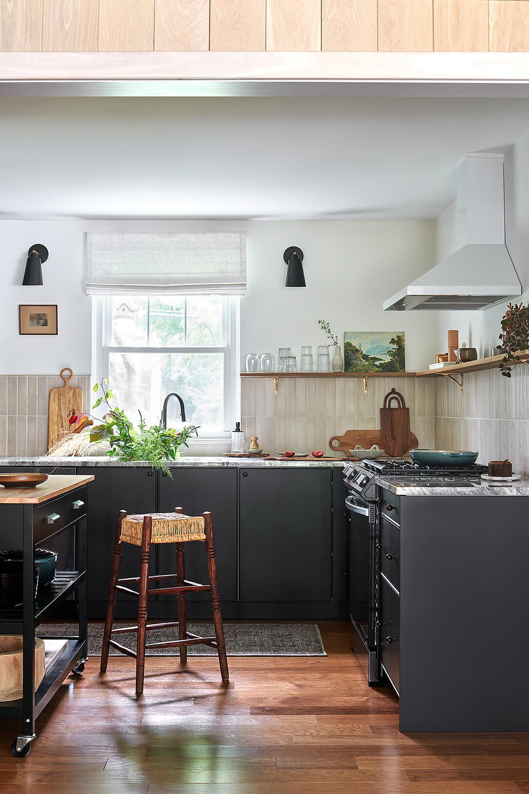
The things that I loved about the refresh were the black lower cabinets and open shelving for our everyday dishes and ceramics. The idea behind these elements worked, and just needed a little bit of refinement to bring them in line with the overall style of the home. We began the design process with a moodboard - a visual representation to guide the design process. To soften and balance the black lower cabinets, we worked in elements with a strong organic feeling like natural stone and tile with variation, while keeping the overall MCM vibes.

We started the remodel by tearing out all of the existing cabinetry and the tile floors. The floor tiles were replaced with the same engineered hardwood that runs throughout the rest of the home, creating a seamless transition from the family room into the kitchen and the dining room. The overall layout for the kitchen was revised to include a built-in refrigerator and to move the range to a more prominent location to the right of the sink. The new layout allowed us to create an entirely new bank of cabinets to house a coffee station and plenty of much needed pantry storage.
For the cabinetry, we turned to BOXI by Semihandmade and also used IKEA cabinets with Semihandmade fronts. The design team at BOXI was able to confirm my measurements and work with me to explore their product line to create the final layout. From the cabinets, to filler pieces, to installation drawings, the BOXI made sure that we would have everything that we needed to install the cabinets correctly. For the largest bank of cabinets that house the fridge, sink, and range, we specified the BOXI Peppercorn Edge profile. The BOXI cabinets come fully assembled and installation was a breeze thanks to the adjustable feet that make leveling the cabinets super simple.


While the “After” photos may not look that different from the “Before” photos, it’s the small and unseen things that make such a big difference in how the kitchen functions. The new BOXI cabinets offered us a huge amount of increased storage - with room for pots and pans, plenty of drawers for knives, cooking utensils, and silverware, we are able to keep the majority of our utility items out of sight when not in use. On all of the black cabinets, we used delicate knobs in an oil-rubbed bronze finish. The tiny knobs pair well with the slim cabinet edge profile and the warmth of the bronze keeps it from feeling stark.
The old laminate countertops were replaced with beautiful Brown Fantasy Marble adding warmth, movement, and a connection to the natural interior stone walls in the family room. We kept the concept of the original open shelving but made it more narrow to accommodate the range and vent hood and swapped out the industrial-style black brackets with more delicate hand-casted brass brackets. The wood from the shelving was salvaged from my in-laws farm, adding a little personal touch.
For the backsplash, we installed the warm beige tiles in a vertical stack - a subtle nod to the v-groove white oak paneling. I love how the varied tones and matte finish contrast with the polished marble. A white composite undermount single-bowl sink is paired with a sleek matte-black faucet. The appliances (links below) are all a black stainless finish to blend in with the black lower cabinets. We added a vintage-style runner from the Amber Lewis x Loloi Collection along the sink wall, bringing an element of softness and comfort to the kitchen. To allow for plenty of flexibility, we decided on a small kitchen island on casters that can easily be moved out of the way if needed.
The open shelves are styled with a mix of functional items and some of my favorite original artwork and handmade ceramics. The handmade plates to the right of the range are from Facture Goods, the stripped mug to the left is from Veak Ceramics, the original painting on the left is from Philadelphia-based artist Holly Dudley, and the wood boards are Nicole’s own designs from her woodcarving days as well as a piece from woodworker Steph Trowbridge.

Fridge | Range | Dishwasher | Faucet | Vent Hood | Runner | Shelf Brackets | Stool (vintage)
For the secondary bank of cabinets on the opposite side of the kitchen, I wanted to use paintable fronts so that the design could reference the large credenza in the family room and to maintain a feeling of lightness since we were adding upper cabinets. The bases for the cabinets are IKEA and I love this product for the flexibility it offers. We included hidden drawers, a trash can pull-out, and tons of upper storage. The cabinet fronts and panels are the Sarah Sherman Samuel DIY Quarterline Fronts from Semihandmade painted in Revere Pewter by Benjamin Moore. I brush painted the fronts so that they have a handmade feeling to them and offer plenty of flexibility if they needed to be repainted or touched-up in the future. I wanted this part of the kitchen to feel more like a built-in piece of furniture so we added base moulding and crown, also painted in the same Revere Pewter. Overall, I think that this side of the kitchen is a great juxtaposition to the bank of black cabinets. The mix of both masculine and feminine elements works to create design tension and helps the renovated space to feel more considered and collected.

Before we sign off, here is one more look at the “Before” and “Afters”. We couldn’t be happier with the finished product. Cooking here is a dream, with everything right at our fingertips and the combination of finishes feels personal, cohesive, and settled in our 1950’s ranch home.
“Before”


and “AFTER”


Thanks so much for sharing this beautiful project Sara, it’s wonderful to see how shifts in the appliance layout, cohesive flooring, and a layered, united color palette changes the whole dynamic of a space. The utilization of more drawers vs. open cabinets also makes a huge functionality difference for the space, it’s one of our favorite ways to make a kitchen more functional for clients. Thank you all for following along on this special project reveal, we know that both clients and design lovers can hopefully get something out of this post, whether it’s ideas for your own DIY kitchen remodel, or looking to vestige HOME for help in designing and project managing your dream kitchen.
Cheers,
Nicole